Brand identity for Bridge Physical Therapy: A brand with a little team spirit.
Brand identity for Bridge Physical Therapy: A brand with a little team spirit.
Client
Bridge Physical Therapy & Performance
Services
Logo Design
Brand Identity
Custom Illustration
Print Design
Bridging Rehabilitation and Performance
Bridging Rehabilitation and Performance
Bridge Physical Therapy & Performance needed an identity that communicated its unique position between rehabilitation and athletic performance. The challenge was to capture that idea without relying on an obvious bridge icon or the typical visual language used in physical therapy.
The strategy centered on making the bridge itself part of the brand, rather than simply illustrating one.


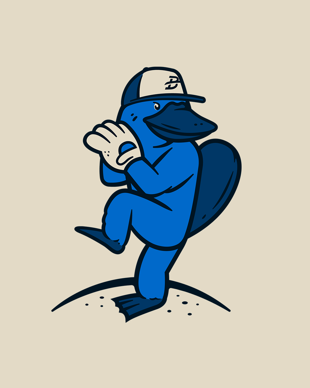
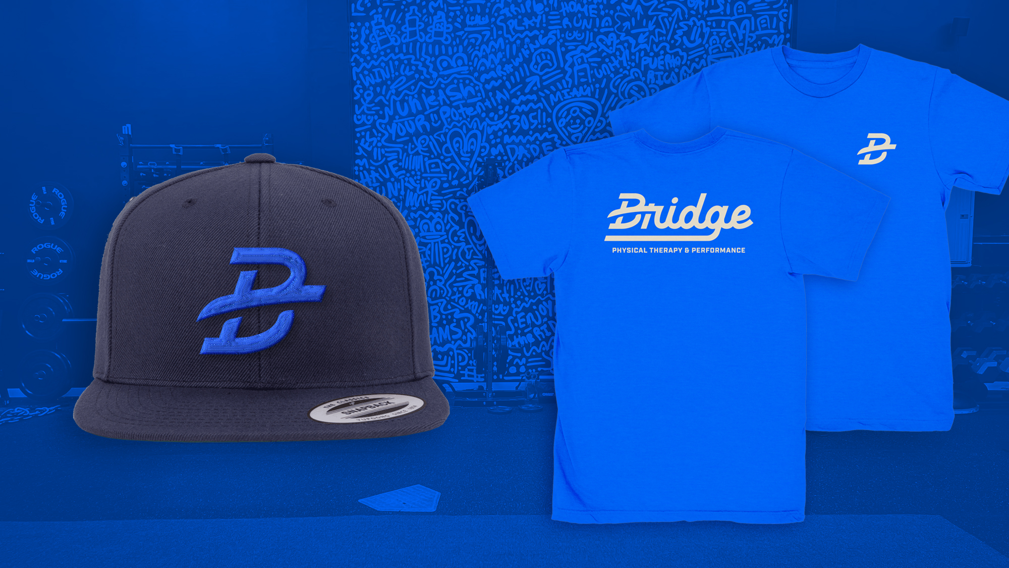
Baseball is a big part of Bridge’s culture, so the identity needed to reflect that personality while communicating the connection between rehabilitation and athletic performance. Rather than using a literal bridge icon, the bridge structure moves directly through the B in Bridge, creating a visual connection between the letters and reinforcing the idea of moving from one stage to the next.
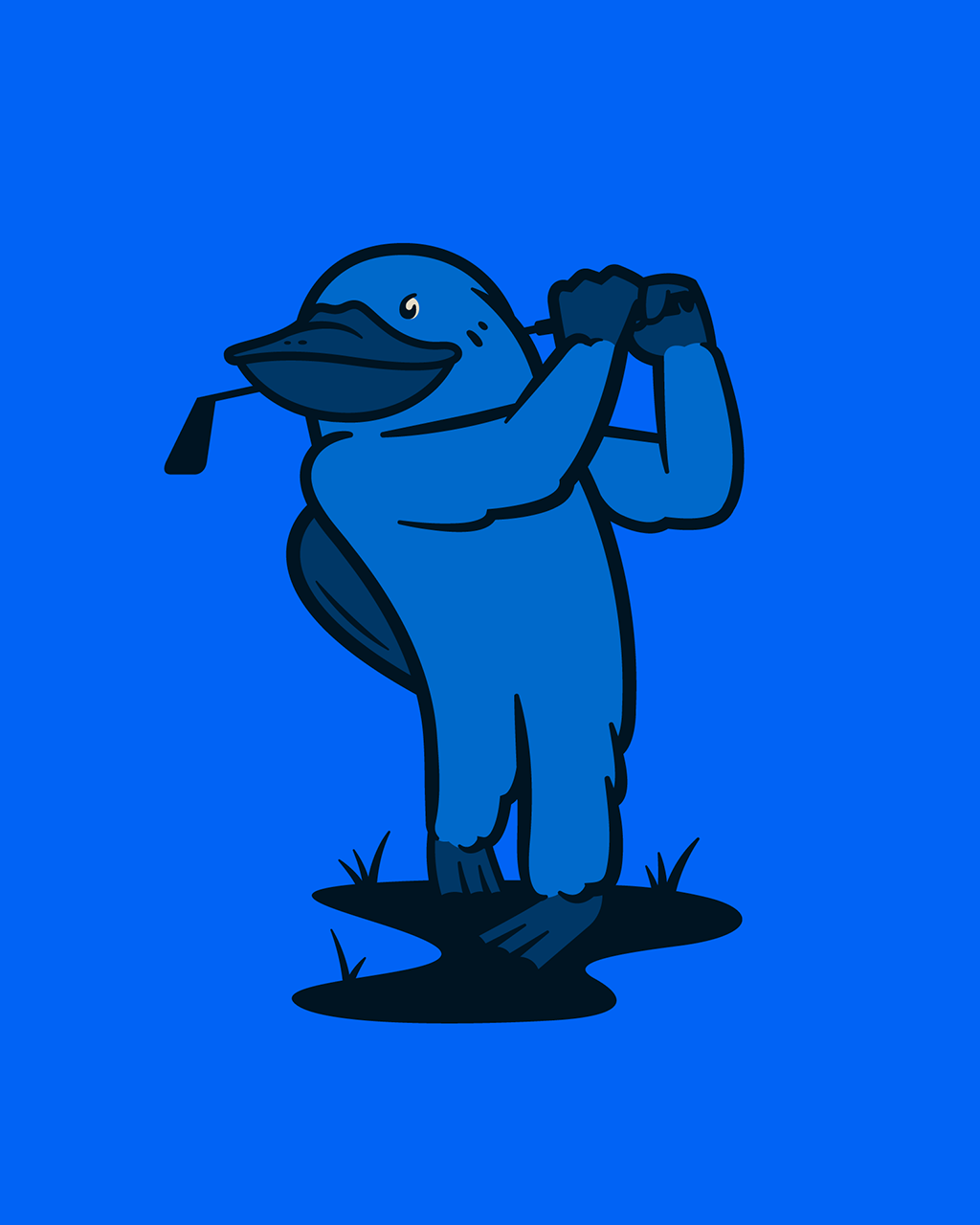
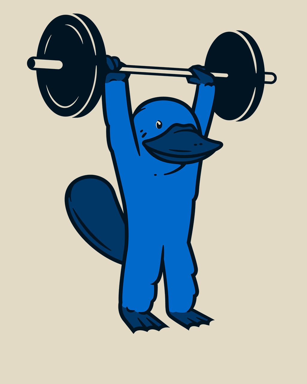
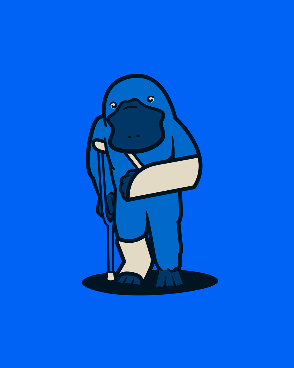
A custom script inspired by classic baseball team lettering adds an athletic feel without making the brand look like a traditional sports team. That personality extends to Plyo the Platypus, Bridge’s custom mascot, adding a playful element that connects with athletes, families, and the local baseball community.